Completion requirements
View
2. Floating multiple elements
It is perfectly fine to float multiple elements on a page or even within a single element. In fact, it is one way to turn a list of links into a horizontal menu, as we will see in a moment.
When you float multiple elements, there is a complex system of behind-the-scenes rendering rules that ensures floated elements do not overlap. You can consult the CSS specification (https://www.w3.org/Style/CSS/specs.en.html) for the details, but the
upshot of it is that floated elements will be placed as far left or right (as specified) and as high up as space allows.
The figure below shows what happens when a series of sequential paragraphs are floated to the same side. The first three floats start stacking up from the left edge, but when there isn’t enough room for the fourth, it moves down and to the left until it bumps into something—in this case, the edge of the browser window. In any case, in the event that one of the floats, for example, "P2," had been exceptionally long, it would have bumped the edge of the long floats.
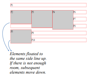
Here is the code below to see the actual result
<!DOCTYPE html>
<!-- CSS Float -->
<html>
    <head>
        <title>On CSS Float </title>
        <meta charset="UTF-8">
        <meta name="author" content="My Name">
        <meta name="keywords" content="HTML, CSS, Float">
        <meta name="revised" content="21-10-2020">
    </head>
    <style>
        p.float2 {
          float: left;
          width: 150px;
          height: 70px;
          margin: 0px;
          background : #CCC;
         }
        p {border: 1px solid red;}
        p.float3 {
          float: left;
          width: 150px;
          height: 90px;
          margin: 0px;
          background : #CCC;
         }
        p{border: 1px solid red;}
        p.float4 {
          float: left;
          width: 150px;
          height : 100px;
          margin: 0px;
          background : #CCC;
         }
        p{border: 1px solid red;}
        p.float5 {
          float: left;
          width: 150px;
          height: 70px;
          margin: 0px;
          background : #CCC;
        }
    </style>
<body>
    <p>P1</p>
    <p class="float2">P2</p>
    <p class="float3">P3</p>
    <p class="float4">P4</p>
    <p class="float5">P5</p>
    <p>P6</p>
    <p>P7</p>
    <p>P8</p>
    <p>P9</p>
    <p>P10</p>
</body>
</html>
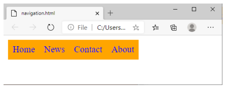
That is the underlying behavior, but let us apply it to something more practical, like a navigation menu. It makes sense semantically to mark-up navigation as an unordered list, as shown here. We have omitted real URL values in the a elements to simply the markup.
<ul>

 <li><a href = "#">Home</a></li>

 <li><a href = "#">News</a></li>

 <li><a href = "#">Contact</a></li>

 <li><a href = "#">About</a></li>

</ul>
There are various approaches to converting it to a horizontal bar but the primary steps in our floating example are as follows.
1. Turn off the bullets, and set padding and margins to zero.
ul {

 list-style-type: none;

 margin: 0;

 padding: 0;

 }
2. Float each list item to the left so they line up, taking advantage of the multiple float behavior described earlier.
li {

 float: left;

 }
3. Make the anchor elements in the list items (a) display as block elements so you can set the dimensions, padding, margins, and other visual styles. You could set the styles for the other link states as well (such as a:hover), but we’ll keep this example
short.
li a {

    display: block;

    padding: 8px;

    background-color: orange;

    text-decoration: none;

}
Note: The li a is a descendant selector in CSS that matches all <a> elements that are inside an <li> element
4. Clear the element that comes after the menu in the document, so it starts below the menu.
This will produce the following result: