CSS Float (Floating Multiple Elements)
| Site: | Philippine Science High School - MC - Knowledge Hub |
| Course: | SY25.CS3.Web Development |
| Book: | CSS Float (Floating Multiple Elements) |
| Printed by: | , Guest user |
| Date: | Tuesday, 14 April 2026, 2:41 AM |
1. Introduction
After completing this module, you are expected to:
- float multiple elements;
- float elements in a container;
- use floats to create columns.
The previous learning module explains the basics of floating property. Let us look at more
examples and explore additional floating behaviors. With CSS, it is possible to float multiple elements,
float all the elements in a container element to create a multicolumn layout, as we will see in this module.
2. Floating multiple elements
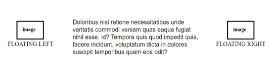
It is perfectly fine to float multiple elements on a page or even within a single element. In fact, it is one way to turn a list of links into a horizontal menu, as we will see in a moment.
When you float multiple elements, there is a complex system of behind-the-scenes rendering rules that ensures floated elements do not overlap. You can consult the CSS specification (https://www.w3.org/Style/CSS/specs.en.html) for the details, but the
upshot of it is that floated elements will be placed as far left or right (as specified) and as high up as space allows.
The figure below shows what happens when a series of sequential paragraphs are floated to the same side. The first three floats start stacking up from the left edge, but when there isn’t enough room for the fourth, it moves down and to the left until it bumps into something—in this case, the edge of the browser window. In any case, in the event that one of the floats, for example, "P2," had been exceptionally long, it would have bumped the edge of the long floats.
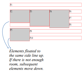
Here is the code below to see the actual result
<!DOCTYPE html>
<!-- CSS Float -->
<html>
    <head>
        <title>On CSS Float </title>
        <meta charset="UTF-8">
        <meta name="author" content="My Name">
        <meta name="keywords" content="HTML, CSS, Float">
        <meta name="revised" content="21-10-2020">
    </head>
    <style>
        p.float2 {
          float: left;
          width: 150px;
          height: 70px;
          margin: 0px;
          background : #CCC;
         }
        p {border: 1px solid red;}
        p.float3 {
          float: left;
          width: 150px;
          height: 90px;
          margin: 0px;
          background : #CCC;
         }
        p{border: 1px solid red;}
        p.float4 {
          float: left;
          width: 150px;
          height : 100px;
          margin: 0px;
          background : #CCC;
         }
        p{border: 1px solid red;}
        p.float5 {
          float: left;
          width: 150px;
          height: 70px;
          margin: 0px;
          background : #CCC;
        }
    </style>
<body>
    <p>P1</p>
    <p class="float2">P2</p>
    <p class="float3">P3</p>
    <p class="float4">P4</p>
    <p class="float5">P5</p>
    <p>P6</p>
    <p>P7</p>
    <p>P8</p>
    <p>P9</p>
    <p>P10</p>
</body>
</html>
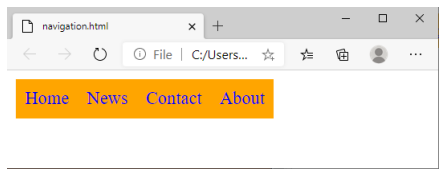
That is the underlying behavior, but let us apply it to something more practical, like a navigation menu. It makes sense semantically to mark-up navigation as an unordered list, as shown here. We have omitted real URL values in the a elements to simply the markup.
<ul>

 <li><a href = "#">Home</a></li>

 <li><a href = "#">News</a></li>

 <li><a href = "#">Contact</a></li>

 <li><a href = "#">About</a></li>

</ul>
There are various approaches to converting it to a horizontal bar but the primary steps in our floating example are as follows.
1. Turn off the bullets, and set padding and margins to zero.
ul {

 list-style-type: none;

 margin: 0;

 padding: 0;

 }
2. Float each list item to the left so they line up, taking advantage of the multiple float behavior described earlier.
li {

 float: left;

 }
3. Make the anchor elements in the list items (a) display as block elements so you can set the dimensions, padding, margins, and other visual styles. You could set the styles for the other link states as well (such as a:hover), but we’ll keep this example
short.
li a {

    display: block;

    padding: 8px;

    background-color: orange;

    text-decoration: none;

}
Note: The li a is a descendant selector in CSS that matches all <a> elements that are inside an <li> element
3. Using floats to create columns
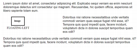
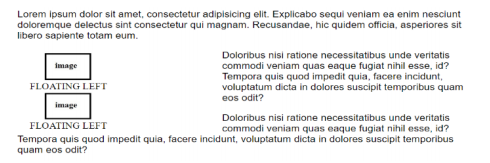
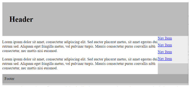
So far, we have floated small parts of a page, but as mentioned earlier, you can also float whole sections of the page to create columns. In fact, that is the way the pros do it! There are a couple of solutions, and they mostly come down to a matter of preference.
Float one div and add a wide margin on the side of the text element that wraps around it.
Float both divs to the left or right.
Float one div to the left and the second div to the right (or vice versa).
<!DOCTYPE html>
<!-- CSS Float -->
<html>
    <head>
        <title>On CSS Float </title>
        <meta charset="UTF-8">
        <meta name="author" content="My Name">
        <meta name="keywords" content="HTML, CSS, Float">
        <meta name="revised" content="21-10-2020">
        <style>
            body {
                 margin: 0;
                 padding: 0;
                 background: #ccc;
             }
            #container {
                width: 960px;
                margin: 0 auto;
             }
            #header {
                 padding: 30px;
                 background: #bbb;
             }
            #content {
                 float: left;
                 width: 660px;
                 background: #fff;
             }
            #navigation {
                 float: right;
                 width: 300px;
                 background: #eee;
             }
            #navigation a {
                 display: block;
                 margin: 0 0 10px 0;
             }
            #footer {
                 clear: both;
                 background: #aaa;
                 padding: 10px;
             }
        </style>
    </head>
    <body>
        <div id="container">
            <div id="header">
                <h1>Header</h1>
            </div>
            <div id="content">
                <p> Lorem ipsum dolor sit amet,
                consectetur adipiscing elit. Sed auctor placerat
                metus, sit amet egestas dui rutrum sed. Aliquam eget
                fringilla metus, vel pulvinar turpis. Mauris
                consectetur purus convallis nibh consectetur, nec
                mattis nisi euismod.</p>
             </div>
            <div id="navigation">
                 <a href="#">Nav Item</a>
                 <a href="#">Nav Item</a>
                 <a href="#">Nav Item</a>
                 <a href="#">Nav Item</a>
            </div>
            <div id="footer">Footer</div>
        </div>
    </body>
</html>
4. box-sizing Property
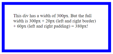
The box-sizing property defines how the width and height of an element are calculated:
should they include padding and borders, or not.
The box property has worked like as shown below:
width + padding + border = actual visible/rendered width of an element's box
height + padding + border = actual visible/rendered height of an element's box
Means when you set the height and width, it appears a little bit bigger than the given size,
when element border and padding are added to the element.
Let us take a look at a simple example below:
<!DOCTYPE html>
<html>
<head>
    <title>box-sizing </title>
    <meta charset="UTF-8">
    <meta name="author" content="My Name">
    <meta name="keywords" content="HTML, CSS, box-sizing">
    <meta name="revised" content="21-10-2020">
    <style>
        #example1 {
            box-sizing: content-box;
            width: 300px;
            height: 100px;
            padding: 30px;
            border: 10px solid blue;
        }
        #example2 {
            box-sizing: border-box;
            width: 300px;
            height: 100px;
            padding: 30px;
            border: 10px solid blue;
        }
     </style>
</head>
<body>
    <div id="example1">
        This div has a width of 300px. But the full width
        is 300px + 20px (left and right border) + 60px (left and
        right padding) = 380px!
    </div>
    <br/>
    <div id="example2">
        Here, the full width is 300px no matter what!
    </div>
</body>
</html>
This will produce the following output:
box-sizing: content-box (default):
Width and height only apply to the content of the element:
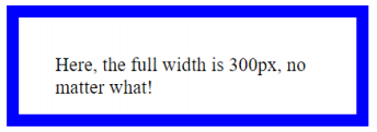
box-sizing: border-box:
Width and height apply to all parts of the element: content, padding and borders:
5. Summary
- Floating is an extremely powerful technique that you will likely end up using quite a bit - it
quickly becomes essential when you want to do more detailed layouts. However, it does come
with a small price of added complexity. We have already shown you a couple of the
"extraordinary" behaviors you will run into when using floats and there are more of them out
there.
- The limitation to using floats for columns is that it is dependent on the order of the elements
in the source document. The floated element must appear before the content that wraps
around it, and your source may not always be ordered conveniently.
- Box sizing property is used to change the height and width of an element.