Completion requirements
View
3. Using floats to create columns
So far, we have floated small parts of a page, but as mentioned earlier, you can also float whole sections of the page to create columns. In fact, that is the way the pros do it! There are a couple of solutions, and they mostly come down to a matter of preference.
Float one div and add a wide margin on the side of the text element that wraps around it.
Float both divs to the left or right.
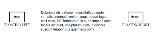
Float one div to the left and the second div to the right (or vice versa).
Let us take a look at a simple example:
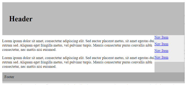
a two-column webpage with the content area on the left, navigation on the right, and a header and footer
area to cap it off.
<!DOCTYPE html>
<!-- CSS Float -->
<html>
    <head>
        <title>On CSS Float </title>
        <meta charset="UTF-8">
        <meta name="author" content="My Name">
        <meta name="keywords" content="HTML, CSS, Float">
        <meta name="revised" content="21-10-2020">
        <style>
            body {
                 margin: 0;
                 padding: 0;
                 background: #ccc;
             }
            #container {
                width: 960px;
                margin: 0 auto;
             }
            #header {
                 padding: 30px;
                 background: #bbb;
             }
            #content {
                 float: left;
                 width: 660px;
                 background: #fff;
             }
            #navigation {
                 float: right;
                 width: 300px;
                 background: #eee;
             }
            #navigation a {
                 display: block;
                 margin: 0 0 10px 0;
             }
            #footer {
                 clear: both;
                 background: #aaa;
                 padding: 10px;
             }
        </style>
    </head>
    <body>
        <div id="container">
            <div id="header">
                <h1>Header</h1>
            </div>
            <div id="content">
                <p> Lorem ipsum dolor sit amet,
                consectetur adipiscing elit. Sed auctor placerat
                metus, sit amet egestas dui rutrum sed. Aliquam eget
                fringilla metus, vel pulvinar turpis. Mauris
                consectetur purus convallis nibh consectetur, nec
                mattis nisi euismod.</p>
             </div>
            <div id="navigation">
                 <a href="#">Nav Item</a>
                 <a href="#">Nav Item</a>
                 <a href="#">Nav Item</a>
                 <a href="#">Nav Item</a>
            </div>
            <div id="footer">Footer</div>
        </div>
    </body>
</html>
This will produce the following result:
Three-column floats work basically the same way, there’s just more calculating to do.
Regardless of which method works best for your content or suits your fancy, there are a few things you need to keep in mind. First, every float needs to have a specified width. Thereafter, you
need to be very careful that you have calculated the widths of each column correctly, factoring in
padding, borders, and margins. If the total width of all the columns exceeds the available width of
the browser or other containing element, you’ll get what is known as “float drop”. That is, the final
floated column will run out of room and get bumped down below the column next to it.
The limitation to using floats for columns is that it is dependent on the order of the elements
in the source document. The floated element must appear before the content that wraps around it,
and your source may not always be ordered conveniently.