Completion requirements
View
4. box-sizing Property
The box-sizing property defines how the width and height of an element are calculated:
should they include padding and borders, or not.
The box property has worked like as shown below:
width + padding + border = actual visible/rendered width of an element's box
height + padding + border = actual visible/rendered height of an element's box
Means when you set the height and width, it appears a little bit bigger than the given size,
when element border and padding are added to the element.
Let us take a look at a simple example below:
<!DOCTYPE html>
<html>
<head>
<title>box-sizing </title>
<meta charset="UTF-8">
<meta name="author" content="My Name">
<meta name="keywords" content="HTML, CSS, box-sizing">
<meta name="revised" content="21-10-2020">
<style>
#example1 {
box-sizing: content-box;
width: 300px;
height: 100px;
padding: 30px;
border: 10px solid blue;
}
#example2 {
box-sizing: border-box;
width: 300px;
height: 100px;
padding: 30px;
border: 10px solid blue;
}
</style>
</head>
<body>
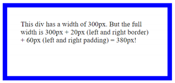
<div id="example1">
This div has a width of 300px. But the full width
is 300px + 20px (left and right border) + 60px (left and
right padding) = 380px!
</div>
<br/>
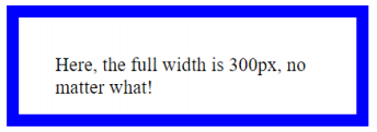
<div id="example2">
Here, the full width is 300px no matter what!
</div>
</body>
</html>
This will produce the following output:
box-sizing: content-box (default):
Width and height only apply to the content of the element:
box-sizing: border-box:
Width and height apply to all parts of the element: content, padding and borders: