Basics of CSS Float
| Site: | Philippine Science High School - MC - Knowledge Hub |
| Course: | SY25.CS3.Web Development |
| Book: | Basics of CSS Float |
| Printed by: | , Guest user |
| Date: | Tuesday, 14 April 2026, 2:41 AM |
1. Introduction
After completing this module, you are expected to:
- float elements to the left and/or to the right;
- clear floated elements;
- contain floated elements.
At this point, you have learned dozens of CSS properties that allow you to change the appearance of text elements and the boxes they generate. But so far, we have merely been decorating elements as they appear in the flow of the document.
In this module, we will look at floating, the CSS methods for breaking out of the normal flow and arranging elements on the page. Floating an element moves it to the left or right, and allows the following text to wrap around it.
We will start by examining the properties responsible for floating, so you will get a good feel for how the CSS layout tools work.
Before we start moving elements around, let’s be sure we are well acquainted with how they
behave in the normal flow.
2. Normal Flow
In the CSS layout model, text elements are laid out from top to bottom in the order in which they appear in the source, and from left to right (in left-to-right reading languages). Block elements stack up on top of one another and fill the available width of the browser window or other containing element. Inline elements and text characters line up next to one another to fill the block elements.
When the window or containing element is resized, the block elements expand or contract to the new width, and the inline content reflows to fit.
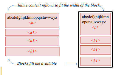
Blocks are laid out in the order in which they appear in the source. Each block starts on a new line.
Objects in the normal flow affect the layout of the objects around them. This is the behavior you’ve come to expect in web pages, elements don’t overlap or bunch up. They make room for another one.
Floating and positioning change the relationship of elements to the normal flow in different
ways. Let us first look at the special behavior of floated elements (or “floats” for short)
3. CSS Float
The CSS float property can make HTML elements float to the left or right inside their parent
element. Content inside the same parent element will move up and wrap around the floating element.
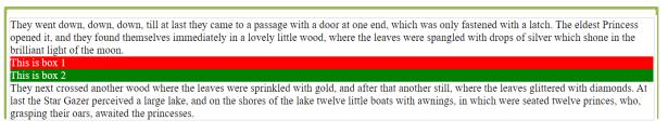
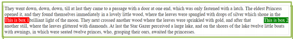
To illustrate how the CSS float property works, let us first look at an HTML example below: The HTML code contains a div element which has a text, two div elements and another text.
<!DOCTYPE html>
    <html>
        <head>
            <title>Module 5.6</title>
        </head>
    <body>
        <div style="border:1px solid #cccccc;">
They went down, down, down, till at last they came to a passage
with a door at one end, which was only fastened with a latch.
The eldest Princess opened it, and they found themselves
immediately in a lovely little wood, where the leaves were
spangled with drops of silver which shone in the brilliant
light of the moon.

            <div style="background-color:red; color:white;"> This is
        box 1 </div>

            <div style="background-color:green; color:white;"> This
        is box 2</div>
They next crossed another wood where the leaves were sprinkled
with gold, and after that another still, where the leaves
glittered with diamonds. At last the Star Gazer perceived a
large lake, and on the shores of the lake twelve little boats
with awnings, in which were seated twelve princes, who,
grasping their oars, awaited the princesses.
        </div>
    </body>
</html>
inside its body. When rendered, the output below shows how it looks like:
Next is to make the two nested div elements floats left and right inside their parent element
using the CSS float property.
3.1. float: left
Now, let us try to make the first nested div element float left using the float CSS property. we do so by setting the CSS float property of the HTML element to the value left. Here an example showing a div element with the CSS float property set to left.
<!DOCTYPE html>
    <html>
        <head>
            <title>Module 5.</title>
        </head>
    <body>
        <div style="border:1px solid #cccccc;">
They went down, down, down, till at last they came to a passage
with a door at one end, which was only fastened with a latch.
The eldest Princess opened it, and they found themselves
immediately in a lovely little wood, where the leaves were
spangled with drops of silver which shone in the brilliant
light of the moon.

            <div style="float:left; background-color:red; color:white;"> This is box 1 </div>

            <div style="background-color:green; color:white;"> This is box 2</div>
They next crossed another wood where the leaves were sprinkled
with gold, and after that another still, where the leaves
glittered with diamonds. At last the Star Gazer perceived a
large lake, and on the shores of the lake twelve little boats
with awnings, in which were seated twelve princes, who,
grasping their oars, awaited the princesses.
        </div>
    </body>
</html>
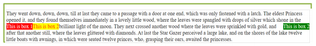
Here is what the example looks like with the left floating element when rendered in the browser:
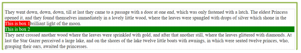
Notice how the first div element (with the red background) now floats to the left inside its
parent element. The first text is now wrapping nicely around the first div element, to the right of it.
The second div element is still positioned below the first div element, and the last text below that.
Now, let us try to make the second nested div float left too. Here is what the code looks like.
<!DOCTYPE html>
    <html>
        <head>
            <title>Module 5.</title>
        </head>
    <body>
        <div style="border:1px solid #cccccc;">
They went down, down, down, till at last they came to a passage
with a door at one end, which was only fastened with a latch.
The eldest Princess opened it, and they found themselves
immediately in a lovely little wood, where the leaves were
spangled with drops of silver which shone in the brilliant
light of the moon.

            <div style="float:left; background-color:red; color:white;"> This is
        box 1 </div>

            <div style="float: left; background-color:green; color:white;"> This
        is box 2</div>
They next crossed another wood where the leaves were sprinkled
with gold, and after that another still, where the leaves
glittered with diamonds. At last the Star Gazer perceived a
large lake, and on the shores of the lake twelve little boats
with awnings, in which were seated twelve princes, who,
grasping their oars, awaited the princesses.
        </div>
    </body>
</html>
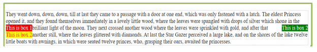
And here is what the code looks like when rendered in the browser:
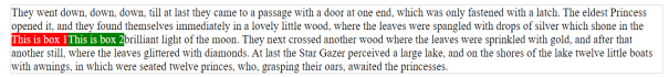
Now both the first and second nested div element is floating to the left inside their parent element. The text wraps nicely around the two-floating element.
3.2. float: right
Now let us try to make the second nested div float to the right instead. We do so by setting its float CSS property to right instead of left. Here is the code:
<!DOCTYPE html>
    <html>
        <head>
            <title>Module 5.</title>
        </head>
    <body>
        <div style="border:1px solid #cccccc;">
They went down, down, down, till at last they came to a passage
with a door at one end, which was only fastened with a latch.
The eldest Princess opened it, and they found themselves
immediately in a lovely little wood, where the leaves were
spangled with drops of silver which shone in the brilliant
light of the moon.

            <div style="float:left; background-color:red; color:white;"> This is
        box 1 </div>

            <div style="float: right; background-color:green; color:white;"> This
        is box 2</div>
They next crossed another wood where the leaves were sprinkled
with gold, and after that another still, where the leaves
glittered with diamonds. At last the Star Gazer perceived a
large lake, and on the shores of the lake twelve little boats
with awnings, in which were seated twelve princes, who,
grasping their oars, awaited the princesses.
        </div>
    </body>
</html>
Here is what it looks like when rendered in the browser:
See how the two elements are now floating in each direction inside their parent element. They
are even located at the same vertical position (towards the top of the parent element). The text now wraps
around the two div elements by being rendered between the div elements.
3.3. clear
Now, let us add a third div element which also floats to the left:
<!DOCTYPE html>
    <html>
        <head>
            <title>Module 5.</title>
        </head>
    <body>
        <div style="border:1px solid #cccccc;">
They went down, down, down, till at last they came to a passage
with a door at one end, which was only fastened with a latch.
The eldest Princess opened it, and they found themselves
immediately in a lovely little wood, where the leaves were
spangled with drops of silver which shone in the brilliant
light of the moon.

            <div style="float:left; background-color:red; color:white;"> This is
        box 1 </div>

            <div style="float: right; background-color:green; color:white;"> This
        is box 2</div>

        <div style=" float:left; background-color:yellow; color:red;">
This is box 2</div>

They next crossed another wood where the leaves were sprinkled
with gold, and after that another still, where the leaves
glittered with diamonds. At last, the Star Gazer perceived a
large lake, and on the shores of the lake twelve little boats
with awnings, in which were seated twelve princes, who,
grasping their oars, awaited the princesses.
        </div>
    </body>
</html>
This is what the code looks like now, when rendered in a browser:
Notice how the two left floating elements are positioned on the same horizontal “line” after each other.
Imagine now that you want the two div elements with the red background to float left, but under each other instead of next to each other. To do that, you need to set the clear CSS property.
The clear CSS property can take one of these values:
- left
- right
- both
- none
The left value means that the element should stay clear of all left floating elements.
The right value means that the element should stay clear of all right floating elements.
The both value means that the element should stay clear of both left and right floating elements.
The none value means no clearing, which is the same as leaving out the clear CSS property.
Let us set the clear CSS property of the last div element to left. Then the last div element should still float left but stay clear of the first left floating div element. Here is how the code looks:
<!DOCTYPE html>
    <html>
        <head>
            <title>Module 5.</title>
        </head>
    <body>
        <div style="border:1px solid #cccccc;">
They went down, down, down, till at last they came to a passage
with a door at one end, which was only fastened with a latch.
The eldest Princess opened it, and they found themselves
immediately in a lovely little wood, where the leaves were
spangled with drops of silver which shone in the brilliant
light of the moon.

            <div style="float:left; background-color:red; color:white;"> This is
        box 1 </div>

            <div style="float: right; background-color:green; color:white;"> This
        is box 2</div>

        <div style=" float:left; clear:left; background-color:yellow; color:red;">
This is box 2</div>

They next crossed another wood where the leaves were sprinkled
with gold, and after that another still, where the leaves
glittered with diamonds. At last, the Star Gazer perceived a
large lake, and on the shores of the lake twelve little boats
with awnings, in which were seated twelve princes, who,
grasping their oars, awaited the princesses.
        </div>
    </body>
</html>
Here is what the code looks like when rendered in a browser:
Text from: Robbins, J. N. (2012). Learning Web Design, 4th Edi3on A Beginners Guide to HTML, CSS, JavaScript and Web Graphics [E-book]. O’Reilly. hIp://wM.tw/ref/robbins.pdf
Notice how the last div element still floats left, but stays under (clear of) the first left
floating div element.
3.4. Containing Floats
As long as we are talking about multiple floats, this is a good time to address another float quirk, and that’s float containment. By default, floats are designed to hang out of the element they are contained in. That’s just fine for allowing text to flow around a floated image, but sometimes this behavior can cause some unwanted behaviors.
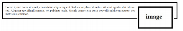
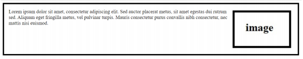
For instance, take the given example below. Clearly, it would be nicer if the border stretched to contain all the content, but the floated image hangs right out the bottom.
If the floating element is taller than the element containing it, then the floating element steps out of its container. You can fix this issue with the overflow property. paired with an auto value, it stretches the container to big enough for the floating element.
The source:
<div>
<img class= “img1” src=“image.jpg” width="200">Lorem ipsum dolor
sit amet, consectetur adipiscing elit. Sed auctor placerat metus,
sit amet egestas dui rutrum sed. Aliquam eget fringilla metus,
vel pulvinar turpis. Mauris consectetur purus convallis nibh
consectetur, nec mattis nisi euismod.
</div>
The style sheet:
<style>
    div {
     border: 4px solid black;
     padding: 15px;
    }
    .img1{
     float: right;
    }
</style>
This will produce the following result:
Without overflow:auto
In the given example, we will fix the overflow problem using the overflow:auto method:
the source
<div class=”clearfix”>
    <img class= “img1” src=“image.jpg” width="200">Lorem ipsum dolor
    sit amet, consectetur adipiscing elit. Sed auctor placerat metus,
    sit amet egestas dui rutrum sed. Aliquam eget fringilla metus,
    vel pulvinar turpis. Mauris consectetur purus convallis nibh
    consectetur, nec mattis nisi euismod.
</div>
the stylesheet
<style>
    div {
         border: 4px solid black;
         padding: 15px;
    }
    .img1{
        float: right;
    }
    .clearfix {
        overflow: auto;
    }
</style>
This will produce the following result:
With overflow:auto
The overflow property is not specifically designed for clearing floats. Use it carefully to avoid unwanted results.
4. Summary
- Elements that seem to float on the right or left side of either the browser window or another element are often configured using float property. The browser renders these elements using normal flow and then shifts them to either the right or left as far as possible within their container (usually either the browser viewport or a div element).
- Use float: right; to flow the element on the right side of the container.
- Use float: left; to float the element on the left side of the container.
- Other elements and web page content will flow around the floated element.