HTML Form tags, Form, input (radio, checkbox) and select
| Site: | Philippine Science High School - MC - Knowledge Hub |
| Course: | SY25.CS3.Web Development |
| Book: | HTML Form tags, Form, input (radio, checkbox) and select |
| Printed by: | , Guest user |
| Date: | Tuesday, 14 April 2026, 2:40 AM |
1. Introduction
After completing this module, you are expected to:
- Design a simple form as user information input
In the previous module, you have learned about the different types of input tags that we can use for our website forms.
For this module, the form tags that we will learn involves providing the user with choices and making the user choose one or more values. The chosen value or values will be the input that will be accepted for processing. The tags that we will learn are radio buttons, checkboxes, and selection lists.
2. Radio Buttons
These buttons are used to give the user a list of related items where he/she can choose only one value at a time. The user can click on any item and when they click another item, the latest item clicked will be the chosen value.
The code below shows an example of the use of radio buttons with three choices. Notice in the code that all three options have the same name. All options that have the same name means that these choices are grouped together. Only one item from a group with the same name can be chosen at any given time.
Notice also the use of the form tag <label>. As was discussed during the previous module, this tag is used to define the input areas in a form. For the for attribute, use the id of the option that you want the label to refer to. In this case, when a user clicks on a label, it selects the radio button associated with it.
The value attribute indicates the value of that item in the set. In the code below, when the first option is selected, the form will return a value of “luzon” as the input of the user. This is not visible to the user. The only visible text for the user is the text inside the <label> tag or any text after the <input type = ”radio”> tag.
Sample code:
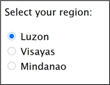
<form>
<p>Select your region:</p>
<input type="radio" id="luzon" name="region" value="Luzon">
<label for="luzon">Luzon</label></br>
<input type="radio" id="visayas" name="region" value="Visayas">
<label for="visayas">Visayas</label></br>
<input type="radio" id="mindanao" name="region" value="Mindanao">
<label for="mindanao">Mindanao</label>
</form>
Sample output:
3. Checkboxes
Checkboxes are like radio buttons where they present the user with a group of related choices and the chosen value is the input of the user for processing. The difference between checkboxes and radio buttons is that checkboxes allow the user to choose more than one value.
The <label> tag in the example below, will also work the same way as discussed previously.
Sample code:
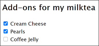
<form>
<h2> Add-ons for my milktea </h2>
<input type="checkbox" id="creamCheese" name="option1" value="Cream Cheese">
<label for="creamCheese"> Cream Cheese</label><br>
<input type="checkbox" id="pearls" name="option2" value="Pearls">
<label for="pearls"> Pearls </label><br>
<input type="checkbox" id="coffeeJelly" name="option3" value="Coffee Jelly">
<label for="coffeeJelly"> Coffee Jelly</label><br><br>
</form>
Sample output:
Notice that the checklist has different names.
3.1. The checked attribute
Upon loading of a webpage that has checkboxes and radio buttons, the default setting is no item is selected. If you want an item to be selected by default, you can use the checked attribute to indicate an item as selected by default.
The code snippet below shows how to use the checked attribute.
<input type="checkbox" id="option" name="option1" value="Option" checked>
<label for="option1"> Cream Cheese</label><br>
3.2. Checkboxes options with the same names but different values
In
the example above, we assigned a unique name for each option with a unique
value. When we need to retrieve the values of all checked options, we have to
check all names if they are checked in order to get all checked options. To
make retrieving of values easier, we can set all options in the same category
to have one name. By using a single name, we can iterate through the choices
like in an array. See the code snippet below for a set of checkbox options with
the same name.
<form onsubmit="return myFunction();">
<h2> Add-ons for my milktea </h2>
<input type="checkbox" id="creamCheese" name="choices" value="Cream Cheese">
<label for="creamCheese"> Cream Cheese</label><br>
<input type="checkbox" id="pearls" name="choices" value="Pearls">
<label for="pearls"> Pearls </label><br>
<input type="checkbox" id="coffeeJelly" name="choices" value="Coffee Jelly">
<label for="coffeeJelly"> Coffee Jelly</label><br><br>
<input type="submit"></input>
</form>
4. Select
The select tag is
used to give the user a list of choices in a dropdown layout. Like the radio
button, you can set it so that only one option can be chosen at a time. But you
can also set it to accept multiple options from the user by using the attribute
multiple, and press on the ctrl or shift key when making
several selections
Notice the use of
<label> tag in this code. Remember the discussion of this tag from the
last module. The <label> tag works here in the same way that label works
for input.
Sample code:
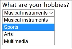
<label for="hob">What are your hobbies?</label></br>
<select name="hobbies" id="hob">
<option value="music">Musical instruments</option>
<option value="sports">Sports</option>
<option value="arts">Arts</option>
<option value="media">Multimedia</option>
</select>
Sample output:
The selected attribute
The selected attribute on the opening <option> tag causes it to be pre-selected, much like the effect of checked attribute for radio and checkboxes.
5. Summary and References
Summary
The tags discussed in this module are used to give a user a set of options where they can choose one or more from a list and the browser will send the selected option/s as the user’s input. For radio buttons only one option can be chosen. For selection, it can be coded so that the user can choose only one option or the user can choose multiple values. For checkboxes, the user can check from the options as many items as they want.
References
W3Schools. (n.d.). HTML <input type="radio">. Retrieved from w3schools.com: https://www.w3schools.com/tags/att_input_type_radio.asp
W3Schools. (n.d.). HTML <input type="checkbox">. Retrieved from w3schools.com: https://www.w3schools.com/tags/att_input_type_checkbox.asp
W3Schools. (n.d.). HTML <input> Tag. Retrieved from w3schools.com: https://www.w3schools.com/tags/tag_input.asp
W3Schools. (n.d.). HTML <select> Tag. Retrieved from w3schools.com: https://www.w3schools.com/tags/tag_select.asp