Text Links
| Site: | Philippine Science High School - MC - Knowledge Hub |
| Course: | SY25.CS3.Web Development |
| Book: | Text Links |
| Printed by: | , Guest user |
| Date: | Sunday, 19 April 2026, 9:16 PM |
1. Introduction
After completing this module, you are expected to:
- Enhance web pages by incorporating links styles and events using CSS
- Identify and practice the latest updates in CSS
During the first quarter, you have learned that links enable users to jump from one page to another, thus allowing them to navigate the Web. To entice users to click on links, we can add designs to links to make them more attractive, easier to use, and helpful in tracking navigation.
Remember that the HTML code for a link is given in the line below. href contains the filename or section name of the page that you want to lead the user to. The text between the <a> and </a> tags is the visible text that is clickable. Note that the clickable area can also be an image.

2. Text Links states using pseudo-classes
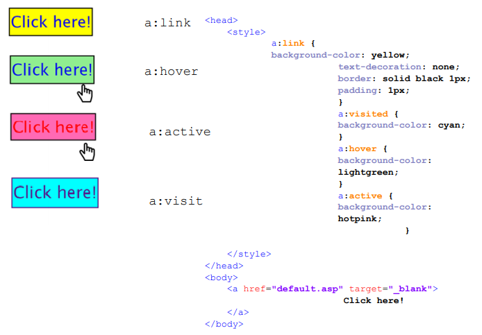
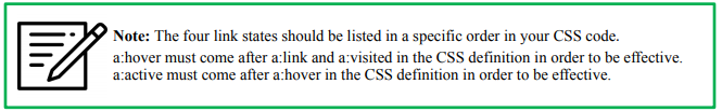
In this module, you will learn how to use CSS to style links. The CSS selector to be discussed is a, and there are four link states (also called pseudo-classes) that can be styled individually. They are listed as follows:
- a:link – a normal, unvisiited link
- a:visited – a link that the user has visited
- a:hover – a link when the user mouses over it
- a:active – a link the moment it is clicked
Underline, overline, line-through Solid, wavy, dotted, dashed, double For more, read on CSS textdecoration Property (https:// www.w3schools.com/cssref/ pr_text_text-decoration.asp)
| Property | Description | Possible Values |
|---|---|---|
| color | Sets the font color of the clickable text in the link | Color values (Hex, RGB, color names)
|
| text-decoration | Sets the style/decoration of the clickable text in the link | Underline, overline, line-through, solid, wavy, dotted, dashed, double. For more, read on CSS textdecoration Property (https:// www.w3schools.com/cssref/ pr_text_text-decoration.asp) |
| background-color | Sets the background color of the area covered by the <a> tag | Color values (Hex, RGB, color names) |
| text-align | Sets the horizontal alignment of the clickable text in the link | Center, left, right, justify |
| padding | Sets a space around the clickable text inside the link | Numerical values with CSS units of measurement |
| border | Sets a border around the area covered by the <a> tag | Color Numerical values with CSS units of measurement Dotted, dashed, solid, double, etc. For more, see CSS Borders |
3. CSS Navigation Bars
Most of the online websites are composed of many web pages with different contents but with a uniform layout and theme. Links are used to allow the user to go from one page to another on the website. When creating links for web pages, grouping together different links for different web pages will make your layout more organized and give the user a sense of “direction” in navigating your website.
Navigation bars, as the name implies, gives the user a way to go around your website. It is defined as a list of links and is formatted in a way that provides the user with an idea of where he or she is on your website.
The code below is a demonstration of how you create a list of links. It is the basic code used for creating navigation bars. All the rest can be achieved with a few tweaks on colors and link states.
Notice the new tag introduced. The <nav> tag is used to contain navigation links in a single block.
This is very much alike to how <div> and <span> are used to group other HTML tags.
Notice also how the <ul> tag is formatted to remove the bullet and the extra spacing. We would not
want that for a navigation bar.
<!DOCTYPE html>
<html>
<head>
<style>
ul {
list-style-type: none;
margin: 0;
padding: 0;
}
</style>
</head>
<body>
<nav>
<ul>
<li><a href="#home">Home</a></li>
<li><a href="#news">News</a></li>
<li><a href="#contact">Contact</a></li>
<li><a href="#about">About</a></li>
</ul>
</nav>
</body>
</html>
3.1. Vertical Navigation Bars
The figure is an example of a vertical navigation bar. This is achieved by
display value of the link inside the list tag as block.
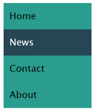
Refer to the given code below and Remember also to retain the proper order of link states in your code.
<!DOCTYPE html>
<html>
<head>
<style>
ul {
list-style-type: none;
margin: 0;
padding: 0;
width: 150px;
background-color: rgb(42,157,143);
}
li a:link{
display: block;
color: black;
padding: 10px;
text-decoration: none;
}
li a:visited{
color: black;
}
li a:hover {
background-color: rgb(38,70,83);
color: white;
}
li a.active {
background-color: rgb(138,177,125);
color: white;
}
</style>
</head>
<body>
<nav>
<ul>
<li><a href="#home">Home</a></li>
<li><a href="#news">News</a></li>
<li><a href="#contact">Contact</a></li>
<li><a href="#about">About</a></li>
</ul>
</nav>
</body>
</html>
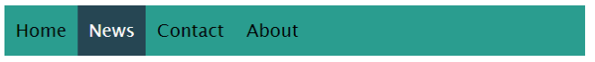
3.2. Horizontal Navigation Bars
You have learned that to create vertical navigation bars, you make use of the display: block
property-value pair to modify the appearance of the links. For horizontal navigation bars, one way is you only
need to change the value of property to inline.
The second way that you can implement horizontal navigation bars is by using the float property.
ul {
list-style-type: none;
margin: 0;
padding: 0;
background-color: rgb(42,157,143);
overflow: hidden;
}
li{
float: left;
}
Check out this link (https://bashooka.com/coding/36-css-link-style-hover-effect-examples/) for
inspiration of link styles. Do not copy and paste. Use them only as a reference.
4. Summary and References
Summary
There are four link states: link, hover, visited, and active. By styling links according to their four states, the user's overall experience in navigating a website will be improved. Make sure to always maintain the order of the link states in your CSS code.
Navigation links on a website with multiple pages can be grouped using navigation bars. Generally, navigation bars can either be horizontal or vertical.
References
CSS Borders. (n.d.). https://www.w3schools.com/css/css_border.asp
CSS Horizontal Navigation Bar. (n.d.). https://www.w3schools.com/css/css_navbar_horizontal.asp
CSS Navigation Bar. (n.d.). https://www.w3schools.com/css/css_navbar.asp
CSS Styling Links. (n.d.). https://www.w3schools.com/css/css_link.asp
CSS Text Decoration. (n.d.). https://www.w3schools.com/css/css_text_decoration.asp
CSS Vertical Navigation Bar. (n.d.). https://www.w3schools.com/css/css_navbar_vertical.asp
HTML <nav> Tag. (n.d.). https://www.w3schools.com/tags/tag_nav.asp