Transform
| Site: | Philippine Science High School - MC - Knowledge Hub |
| Course: | SY25.CS3.Web Development |
| Book: | Transform |
| Printed by: | , Guest user |
| Date: | Tuesday, 14 April 2026, 2:36 AM |
1. Introduction
After completing this module, you are expected to:
- Learn the basic of transform property in CSS3
- Apply the different 2D and 3D transformation methods
In this module, you will be able to learn about the transform property. This transform property
can be applied in both 2D and 3D transformation.
Figure 1 (a) shows the state of the elements before a mouse hovers on the element. Figure 1 (b) is the result after a mouse hovers on the element. This illustrates how a 2D transformation and 3D transformation happens.
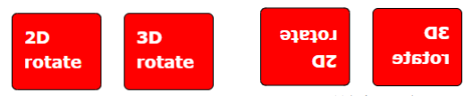
Figure 1: Before and after rotation of the element using the transform property
2. What is CSS transform?
CSS transform is a CSS property that allows you to manipulate an element to add visual
effects. You can skew, rotate, translate, or scale an element (Transform, n.d.-a). The possible values of
this property includes the different transformation methods such as rotate(), scale(), skew(),
translate(), matrix() and others.
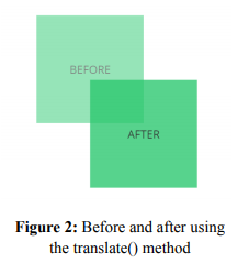
2.1. The translate() Method
To translate an element from its current position to another, the translate() method is used. The movement is based on the given X-axis and Y-axis within the given parameter.
The translate() method requires two parameters. The
first parameter is for the X-axis, while the second parameter is
for the Y-axis. In the given code above, the div element is
moved 50px to the right and 100px going down from its
original position. If only 1 parameter is listed (ex.
translate(50px);), it only moves the element in the X-axis. Below is an example code and the resulting output
div { transform: translate(50px,100px); }
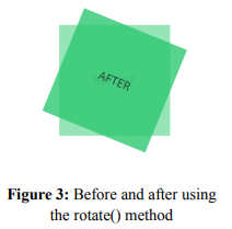
2.2. The rotate() Method
The rotate() method enables the element to rotate
clockwise or counterclockwise. The parameter of this method is
the angle of rotation expressed in degrees. The positive values
will rotate the element clockwise. However, if this is negative,
the element will rotate counter-clockwise. See sample code below and the resulting output:
div { transform: rotate(20deg); }
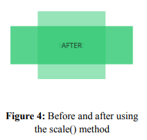
2.3. The scale() Method
The scale() method will enable an element to increase or
decrease its size based on its given width and height. It requires
two parameters. The first parameter will scale the width while the
second parameter is for the height. In the given example below,
the div element will triple its width and decrease its height by
half. If only one parameter is used in this method, both the width
and height will be scaled according to that value. See sample below:
div { transform: scale(3, 0.5); }
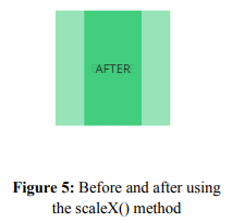
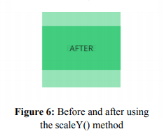
2.4. The scaleX() and scaleY() Method
There are times that you only want the height of an element to increase or decrease. In order to do it, you can use the scaleX() or scaleY() method. The scaleX() and scaleY() method will increase or decrease the width and height, respectively. The parameter will act as a multiplier of the current width or height. For example, scaleX(0.5) will transform the width of an element 0.5 times or half its original width.
div { transform: scaleX(0.5); }
div { transform: scaleY(0.5); }
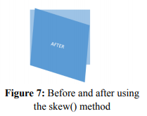
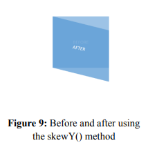
2.5. The skew(), skewX() and skewY() Method
The skew() method will skew the element along its Xaxis and Y-axis. The skewness will be determined by a given angle (in degree), which will be required as parameters of the method. This method will need two parameters which will set the skewness on both X and Y-axis. However, if the second parameter is not specified, it automatically has a zero value. Thus, an element will be skewed along the X-axis only.
div { transform: skew(5deg, 20deg); }
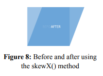
It is also possible to set skewness on X-axis or Y-axis
only. To do this, skewX() or skewY() method is used. Both
methods will require only one parameter.
div { transform: skewX(20deg); }
div { transform: skewY(20deg); }
2.6. The matrix() Method
To combine all the transformation into one, the matrix() method is used. There are six parameters that this method requires. Using these 6 parameters, the element is scaled, skewed and translated, all at once. The parameters required are the values of scaleX(), skewY(), skewX(), scaleY(), translateX() and translateY(), respectively.
div { transform: matrix(1, -0.3, 0, 1, 0,0); }
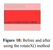
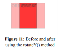
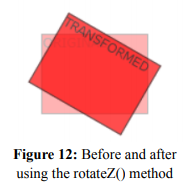
2.7. The rotateX(), rotateY(), rotateZ() Method
The rotate() method allows you to rotate the element clockwise or counterclockwise, depending on the angle of rotation. Using the rotateX() method, you will be able to rotate an element on its X-axis at a given angle of rotation. On the other hand, rotateY() is used to rotate an element around its Y-axis at a given degree. The rotateZ() method will rotate the element in its Z-axis at a given degree.
div { transform: rotateX(150deg); }
div { transform: rotateY(130deg); }
div { transform: rotateZ(90deg); }
 Note: All elements whose layout is ruled by the CSS box model can be transformed. Exceptions to this property include non-replaced inline boxes, table-column boxes, and table-column-group boxes (Transform, n.d.-b).
3. Browser Support
Some browsers may not support the standard syntax of the transform property. To be able to increase compatibility of the property with other browsers, you may add additional syntax for this property, as shown in the example below.
div { -webkit-transform: translate(50px,100px); -ms-transform: translate(50px,100px); -mos-transform: translate(50px,100px); -o-transform: translate(50px,100px); transform: translate(50px,100px); }
The prefix –webkit- is used for lower version of Chrome, Opera, and Safari. From version 9.0
of Internet Explorer going down, the prefix –ms- is used. In Mozilla and Opera, its lower versions
may need to have the prefix –moz- and –o-, respectively (CSS Transform Property, n.d.).
4. Summary and Reference
In Summary,
- CSS transform property will allow you to move, rotate, scale, and skew elements.
- This property will use the transformation methods such as translate(), rotate(), scale(),
scaleX(), scaleY(), skew(), skewX(), skewY() and matrix().
- The matrix() method is used to apply transformation all at once.
- Not all browsers are compatible with the transform properties. In order to resolve compatibility issues, prefixes (e.g., mos-, -webkit-) are used together with this property.